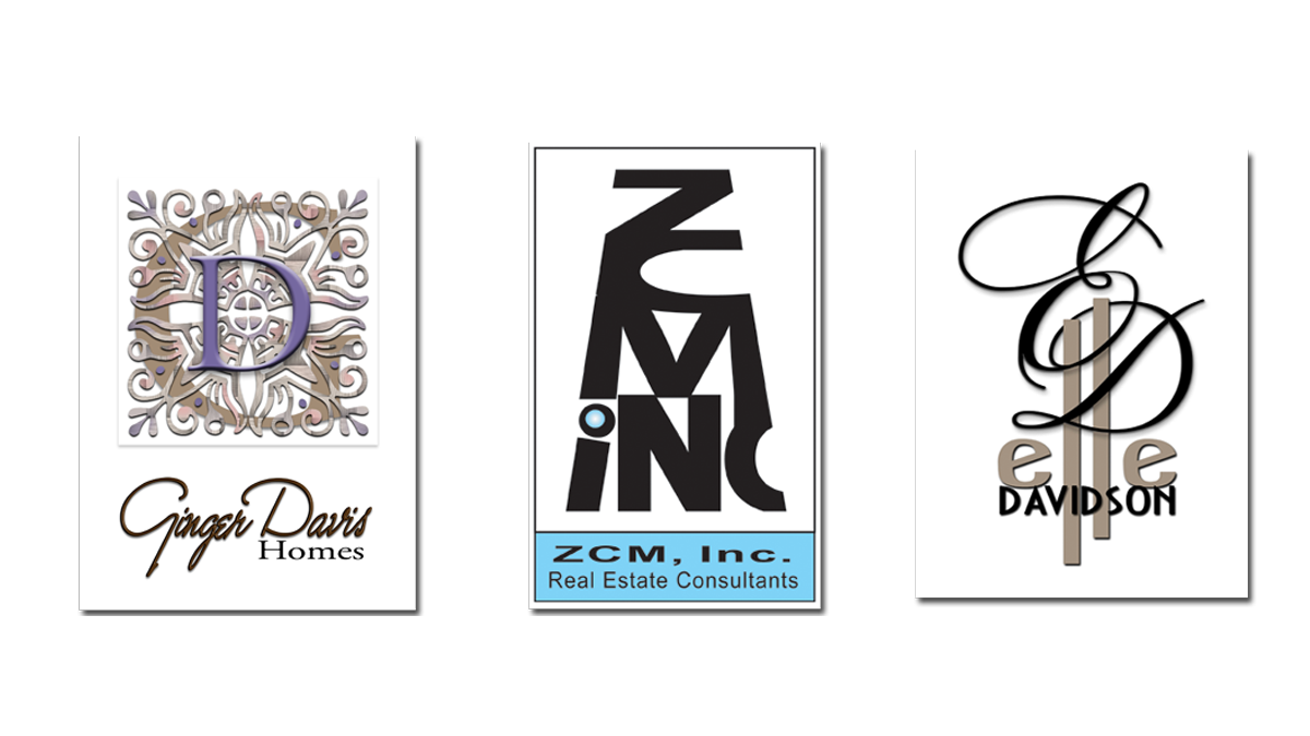
“The easiest way to recognize a company and distinguish it from others is by its logo.”
Every business needs the glam and the glitz and sexiness of color and design spun into a memorable and catchy logo/brand for marketing. I call this make-up for your company! There are some companies by virtue of their enormous list or following, philanthropic and social stature, or gigantic corporate influence that require a toned-down, somewhat conservative look and feel in their branding. There are other companies that demand a brazenly bold and flashy pop-culture splash [and they have the money to do it!] in order to get AND keep the attention of their audience. Then there is the middle-of-the-road guys – the smaller companies and entrepreneurs, solopreneurs, DBA’s, and the professionals who offer a service or product outside of their main career – who need their own brand of “make-up” desperately in order to be seen and cut through the clutter so they can reach their smaller target audience. My point is, a logo and branded look is imperative for ANY company doing business today. If you do not have a logo, now is the time to plan for a design that represents your business and the look and feel of the product and service you offer.
Follow this Guide for Developing a Brand Logo for Your Company
Every business needs a logo, and you’ll want a well designed one if you’re interested in attracting customers and branding your marketing message. But before you start on the journey of having a logo created that represents your company, here is a list of things I have put together that you should think about. Let these things be your guide:
- It is important that your logo and brand is eye-catching with great design and great colors that represent the theme of your marketing.
- Keep it simple. A logo should not be wordy, it should be concise and to the point, bearing your branding tagline and original graphics that can become your “brand mark”.
- Don’t just rely on color, your logo should print in black and white and on a dark background and still POP.
- Your logo should contain the name of your business, if you are a startup, test different names and make sure the domain of the same name is available.
- Don’t rely on trends, you want your logo/brand to be relevant for years to come. Any design that relies too much on what’s trending will look outdated in a few short years. Focus on classic design rules and have something built that lasts.
- Research, research, research! Know your customer and your market and what they will respond to. Know your product and your industry and understand how best to represent it.
- Don’t rely on an amateur to create your logo and brand.
- Stay away from stock art – your logo should be unique and original.
- Please don’t copy others!
- Your logo should contain flexibility in the design. In other words, it should work in various sizes, print, web, color and black and white. I recommend having variations of your logo created for different sizes and even light and dark backgrounds. Having this done now will prepare you for all marketing situations in the future.
- Don’t get cutsie on the type [font], that is, unless you are a baby shower company or sell children’s toys. Every typeface has a personality. Is your brand collegiate? Is it modern or classic? Is it targeted towards teenagers or married professionals in their late 40?s? Keep these things in mind when you select your font style.
Get inspired by researching websites, design sites and artists. Flip through magazines and online blogs, see what successful companies are doing with their logos. Once you are inspired, contact a professional and get the project started.
Lyric Marketing & Design can create your logo and company brand identity – contact Sandy today for more information!


